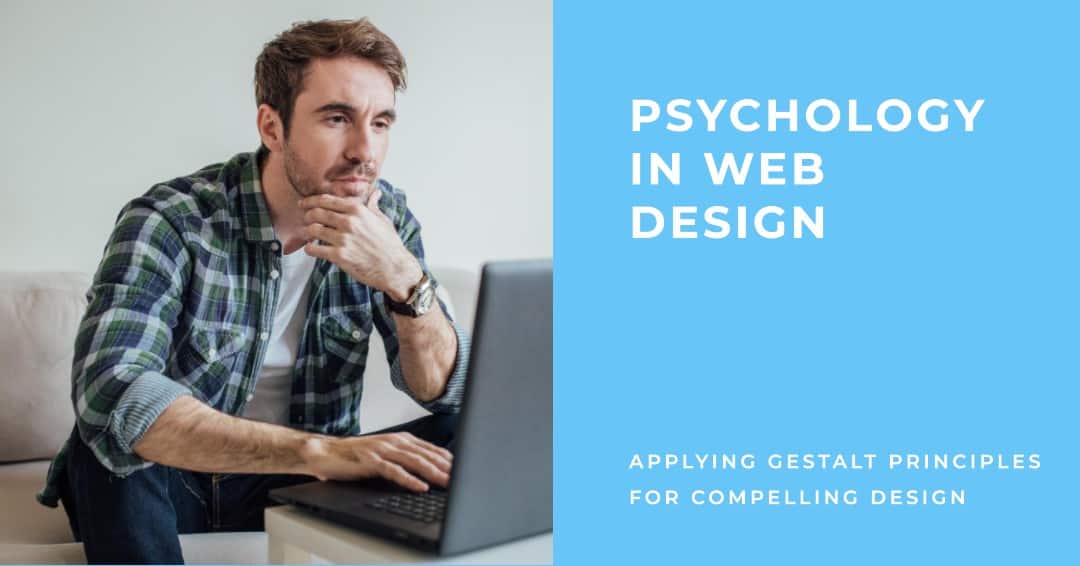
An effective web design captures the attention of the audience with seemingly zero effort. For this, designers usually rely on human psychology and apply it to web designing. This article includes Gestalt Psychology and its uses in web design. We will look at some other design techniques that use color theory, typefaces and more.
What is web design psychology?
The process of creating a good web design using psychological techniques can be termed as web design psychology. Using psychological principles in web design increases its effectiveness. You can lead the users to reach your desired goals using certain design techniques that are based on psychological theories like Gestalt principles.
What is Gestalt Psychology?
Gestalt psychology is a school of psychological thought which was started in the 1920s by German psychologists. At its core, they believe that the whole is greater than the sum of its parts.
In the most basic sense, what Gestalt psychologists propose is that the mind perceives the whole and not its parts. For example, if you look at the following logo, you are looking at the image of a peacock and not merely a group of shapes.
Even certain forms of arts depend heavily on these principles of visual perception. For example, dot painting is a technique in which you paint simple dots in a calculated distance from each other to create a shape. It is the proximity of these dots that make us perceive the shape.
In web design, techniques based on Gestalt principles can be applied to elicit the desired response from the users.
Let’s look at these principles and see how they apply to web design.
Gestalt Principles in Web Design
1. Similarity
According to the law of similarity, we tend to group together certain elements, sections, text, images that share the same characteristics such as color, texture, size or shape.
For example, if a certain shade of yellow is used for a warning message, the reader immediately assumes that yellow text is a warning message/ alert message.
If you use a particular color for indicating products or services that are available at a discount, wherever that color is used on the page, it is easier to recognize the product or service as discounted.

In this image you can see that there are four services that have a discount. The red color makes the section stand out and be grouped together even before you read the text “50% off”.
2. Proximity
The law of proximity states that the objects that are close to each other are assumed to be of the same group.
For example, if you place a bunch of different elements together it is perceived to be part of the same group, separate from other sections. Designers use this technique to differentiate between different products on a page.
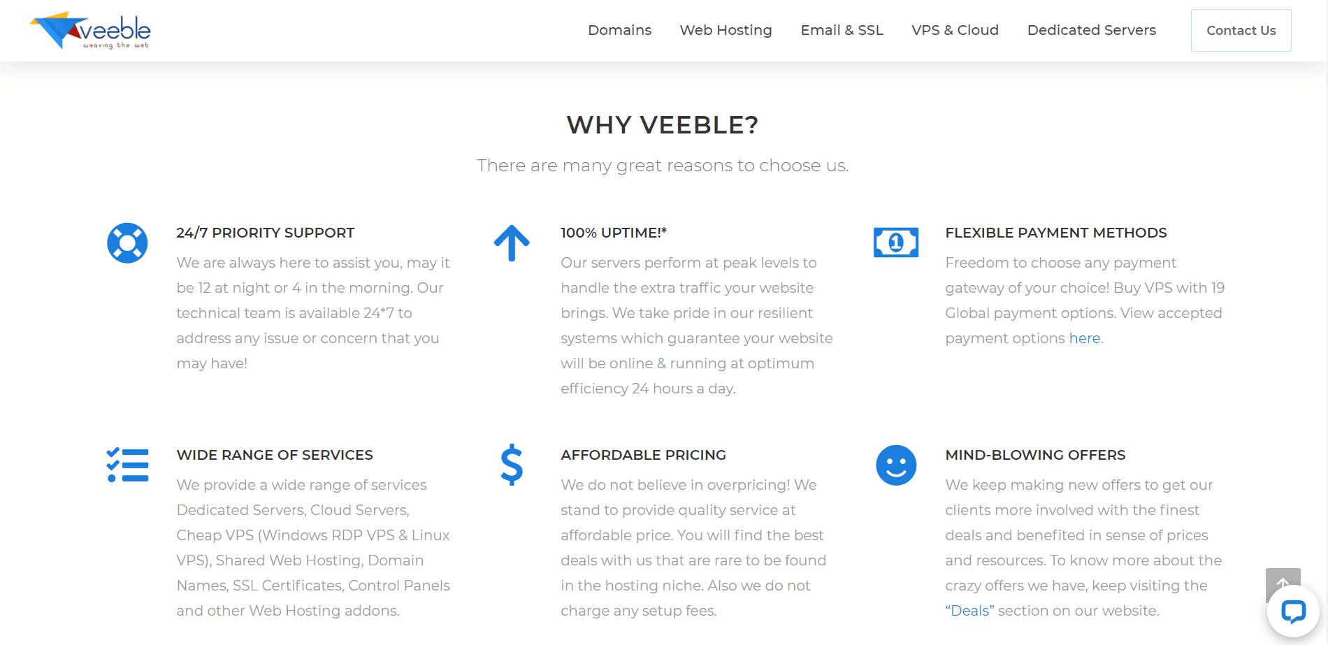
In this screenshot, you can see how proximity is used to create different sections in the content. The ‘24/7 Priority Support’ section is separated from the ‘Wide range of services’ section because all elements of that group are kept close together. These elements include icon, section heading and the body.
3. Symmetry
The human mind always seeks symmetry and pattern in whatever it sees. The law of symmetry is used to convey a proper order.
Even asymmetrical designs can be manipulated to appear symmetrical for a refreshing look. The idea is to bring a coherent balance to the appearance of the page.
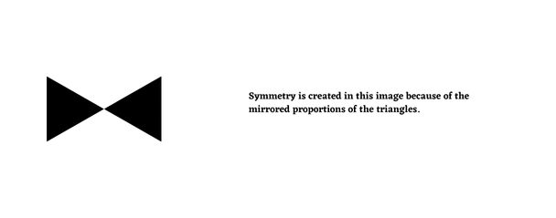
In the image of the triangles, symmetry is created by reflecting the same proportions. Placing the image on left and text on the right creates a visual balance as well.
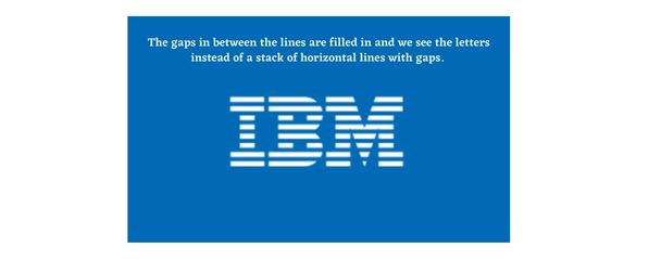
4. Closure
The principle of closure works a lot like the principle of proximity. With the help of this law you can create any shape you want by placing different shapes to form a specific pattern.
As mentioned earlier, the human mind seeks out patterns. Because of this, even a bunch of random shapes will be perceived as a specific pattern if created with such an intention.
5. Continuity
Continuity is created because we tend to follow lines and curves. The painted divisions on roads is a good example of this. Instead of perceiving the pattern as a broken line, we perceive it as a continuous line that separates the traffic.
Continuity makes it easy for designers to guide the visitors to specific sections of the page. Since, this law relies on our tendency to look for a flow, it can be used in flow charts or such instructional content where the user needs to be guided through to a specific end goal.

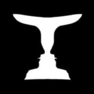
6. Figure and Ground
In this illusion, we assume that the larger area of the image is the ‘background’ (thus the word ‘ground’ ) and the smaller area is the ‘figure’. The contrast of the elements can also influence the way we perceive the figure and ground.
The law can be applied to web design to create elements that stand out when you want them to.
Design to entice
Principles of psychology play an important role in maximizing the outcome of a website design. Incorporating the above mentioned Gestalt principles will help you deliver the desired perceptual experience for your users.
To get the most optimal results for your web design, learn more about Gestalt principles and put the theory to practice.
Now that you know how to create attractive web designs using psychology, then learn the tips to find the best domain name next!