
We make multiple conscious and subconscious decisions throughout the day. Starting from what time to get up to what to have for breakfast to what time to go to bed, we make countless decisions every day. As mundane and harmless as it may seem, there are chances that making one too many decisions could lead to decision fatigue.
In this article, we are going to learn what is decision and how to design your website to avoid this phenomenon to occur in your users. And yes, these concepts are connected! Read on learn how.
What is Decision Fatigue?
Decision fatigue is a psychological phenomenon that occurs when your ability to make the right decisions goes down after having spent a long time making decisions. This is because the process of making a decision requires a considerable amount of cognitive effort and mental energy.
After a long session of making multiple decisions, it’s not surprising that one can reach the point of having decision fatigue.
How are web design and decision fatigue connected?
In the 1950’s, an interesting psychological principle was formulated by two psychologists. They were William Edmund Hick and Ray Hyman. This principle is called the Hick- Hyman Law and it states that the more choices presented to a person, the longer it takes them to make a decision.
This principle is used to design websites to help the user make choices easily and more importantly, to keep the user engaged and increase conversion rates.
If you own an online business (of any kind) and your website is a major source of your income, then you need to know this. A website has many elements that require the users to make several decisions at a time. We can understand it better with an example.
Let’s put ourselves in the user’s shoes for a while, shall we?
So you enter a website to purchase some clothes. What’s the first thing that you do? You first understand the entire layout of the website. Next, you learn how to navigate through the website. Next, you select the category of the clothes you want to purchase. And after that, you decide the size, occasion, type, price range, brand and color of the clothes.
All this maybe done in a few minutes, but in reality, you are making several decisions even before you ask yourself the most important question, “Should I buy this or not?”. If the website is poorly designed, chances are that you will exit the website even before you get to the point of asking yourself this question.
Our goal is to explore 4 ways you can design your website to make it easier for your users to make a purchase decision.
What are the main benefits of designing a website to eliminate decision fatigue?
Here is a list 6 benefits of designing your website to eliminate decision fatigue:
- Improved user experience
- Increased conversion rates
- Enhanced brand perception
- Better SEO performance
- Increased levels of trust
- More user engagement
Now that we have a basic understanding of web design and decision fatigue, let’s learn some ways to design your website to decrease the chances of decision fatigue arising in your users.
How to design your website to eliminate decision fatigue in users
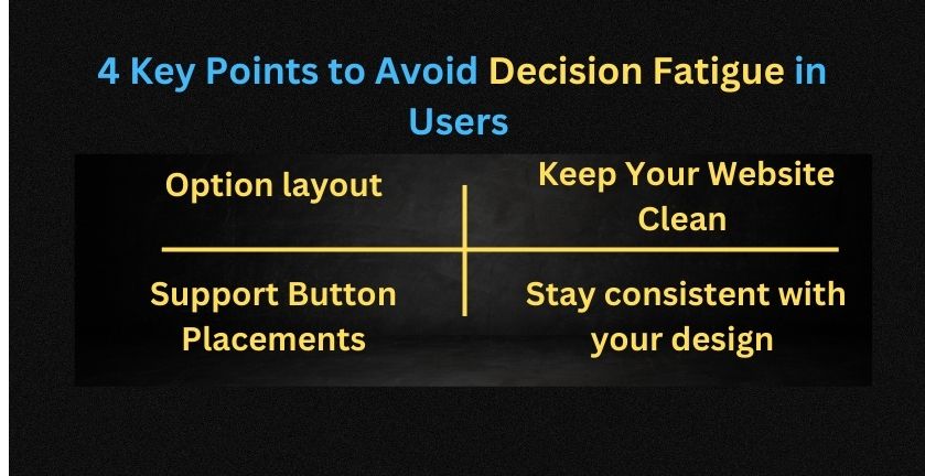
Option layout
Display the purchase options in an organized manner. This will make the customers stay in a relaxed state. If you display all the options they have at once or in a cluttered manner, they will have a hard time analyzing their options, increasing the risk of cognitive exhaustion.
For example, if you have 6-8 different options for the buyers to choose from, display 3-4 options at a time. This will give the customers the time and space to evaluate their choices carefully.
This will also make the customer trust their own decision, and indirectly increase their trust in your brand and products.
Support Button Placements
Place your customer and/or technical support buttons where you think the customers may experience some confusion. If you place the buttons using this strategy, the chances of establishing contact with the customer is higher.
When you have direct contact with the user, you can easily guide them through their purchase decision and therefore have a better chance at a higher conversion rate.
Placing the support buttons in such places also makes the user feel that you care about them and want to help them when they need you. This trust can help you in the long run.
Some areas where the support buttons can be placed include:
- Near category selection
- Near your product/ service display
- Near subscription sections
- Near other CTA buttons
- At the checkout point
Keep Your Website Clean
Use a cleaner website design and theme to reduce distractions, especially on pages that require the attention of your users. When the user needs to make a decision, it will be easier for them to do so when there are less distractions around their options.
This will also ensure that they invest psychologically in making choices and stay engaged with your products/services more. Consequently, your users will make well thought out and relatively quicker decisions.
Stay consistent with your design
Almost close to the last point we discussed, staying consistent with your design can help your users navigate through your website quickly and easily. This is because they can depend on their intuitions.
When they do not have to learn how to navigate through different pages of your website, they have enough cognitive fuel to invest in purchase decisions.
If you have been a little too creative with each page, using different navigation and adding new/ unexpected elements, the user would be confused and won’t have the energy or willingness to make the decision you want them to make.
Which is pretty obvious because the user will be asking themselves, “How do I go around this website?” instead of asking, “What should I buy?”.
So stay consistent.
In a Nutshell
So the question we started off with was “How to design your website to eliminate decision fatigue?”.
We answered this question with quite interesting tips. So let’s take a quick look at these web design tips again.
Keep your options to the minimum at a time. This tip is related to the Hick- Hyman law. The lesser options you display to your users at a time, the easier it will be for them to make a choice.
The second tip is to place support buttons where you think the user would need assistance. These areas could be category selection sections, production/ service displays, subscription sections, near other important CTA buttons, and at the checkout point.
Third tip is to keep your website clean. This is a not- so – surprising tip, but it works! And it is really important too. The more cluttered your website is, the more confused users will be. And we totally want to avoid that! So, stay clean!
Lastly, stay consistent with your design. You don’t want to make your users learn how to navigate your website again and again, and then again.
And that’s all for the web design tips to decrease the chances of decision fatigue in your users. We hope this helps!