Colour plays a vital role in a website’s overall appearance. This is because they communicate your intentions and values. The colour blue in a website or even a brand logo builds trust among customers. The color yellow on the other hand is associated with happiness and fun. This is how colour psychology works in web design.
So when designing a website, keep in mind what the colours are associated with!
It is wise and safe to go with colours that your industry is closely related to. However, it would be helpful to use the perfect shade variant that communicates the nuances of your brand message.
If you incorporate colours that are unique to your brand, it is easy for your customers to understand what makes you different from others.
In this article, we will look into the meanings associated with different colours and how you can effectively apply them to your website design to communicate with your users.
Colour Psychology In Web Design
In its simplest sense, colour psychology is the study of the relationship between colours and human behaviour. It examines how colours can influence human emotions and direct behaviour.
Each colour has its own unique meaning and purpose in the field of web design. It is important to note that the meanings discussed here are generalized. Individual reactions to colours are cultivated over time and are influenced by culture and upbringing.
1. Red to Increase Urgency
Red is often used to increase urgency. This is because the colour red prompts you to take action. It is also closely associated with passion, confidence, fierceness and excitement.
It is known to increase heart and respiratory rates. This is the psychology behind using red for creating urgency in customers. When red banners say “50% off! Limited time only!” your heart may skip a beat without even knowing what the product is!
The color red is used to create urgency in the user by grabbing their attention and elevating their heart rates.
2. Blue for Calmness, Peace, Trust
The colour blue is associated with calmness, peace, trust and tranquillity. It is also one of the most popular colours among both men and women. Blue is known to increase productivity and creativity. So you can use blue in your website according to the nature of your services.
One general use of the colour is to make customers feel calm. Unlike red, blue tends to make the heart rate slow.
This makes the users feel calmer and increases their trust. Using blue elements near the cart and checkout sections is a good idea to calm the buyers before purchasing and gain their trust.
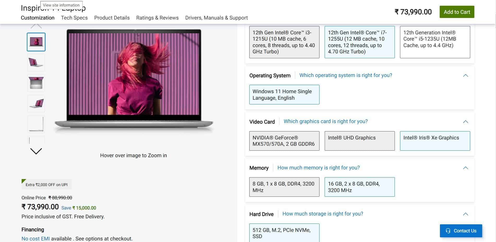
Dell has used blue in various areas on its product page. The ‘save’ highlight in the blue text next to the product price combined with green is subtle and calming. The help button is in blue assuring the customer that they are always assisted.
3. Green for Nature, Growth, Money & Health
Green is universally associated with nature, growth, money and health. It signifies approval and security. This explains why the green secure tag on the search bar next to your domain is so important!
Green CTA buttons are a great way to increase a sense of achievement in your customers. It is reassuring and makes them feel like they have successfully achieved something because the colour is so often associated with positive actions.
It is also used by travel and tourism industries to show their connection with nature. When you visit a tourism website you can often see the color green to bring you closer to nature and the wild.
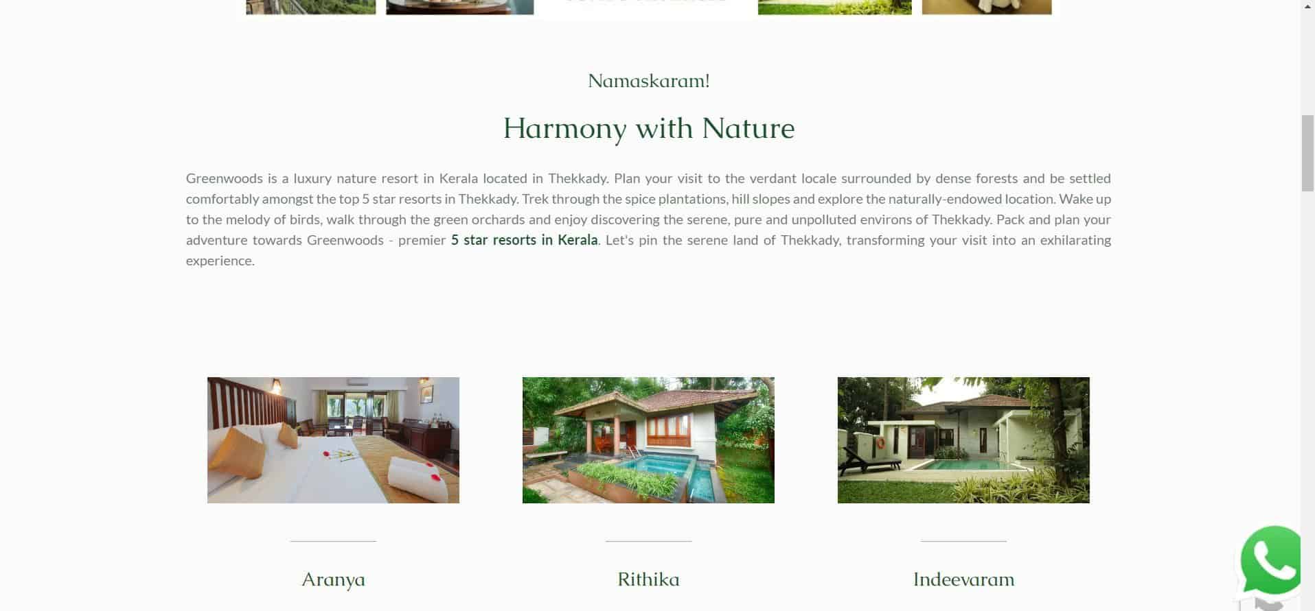
Greenwoods Resort uses the colour green in its font and images to create a sense of refreshment and tranquillity in the user. It emphasizes its connection with nature and wilderness with colour.
Yellow is closely associated with happiness and fun. It is an attractive colour and can make one feel carefree and joyful. However, if the colour is overdone, it can be a little too overwhelming and counterproductive.
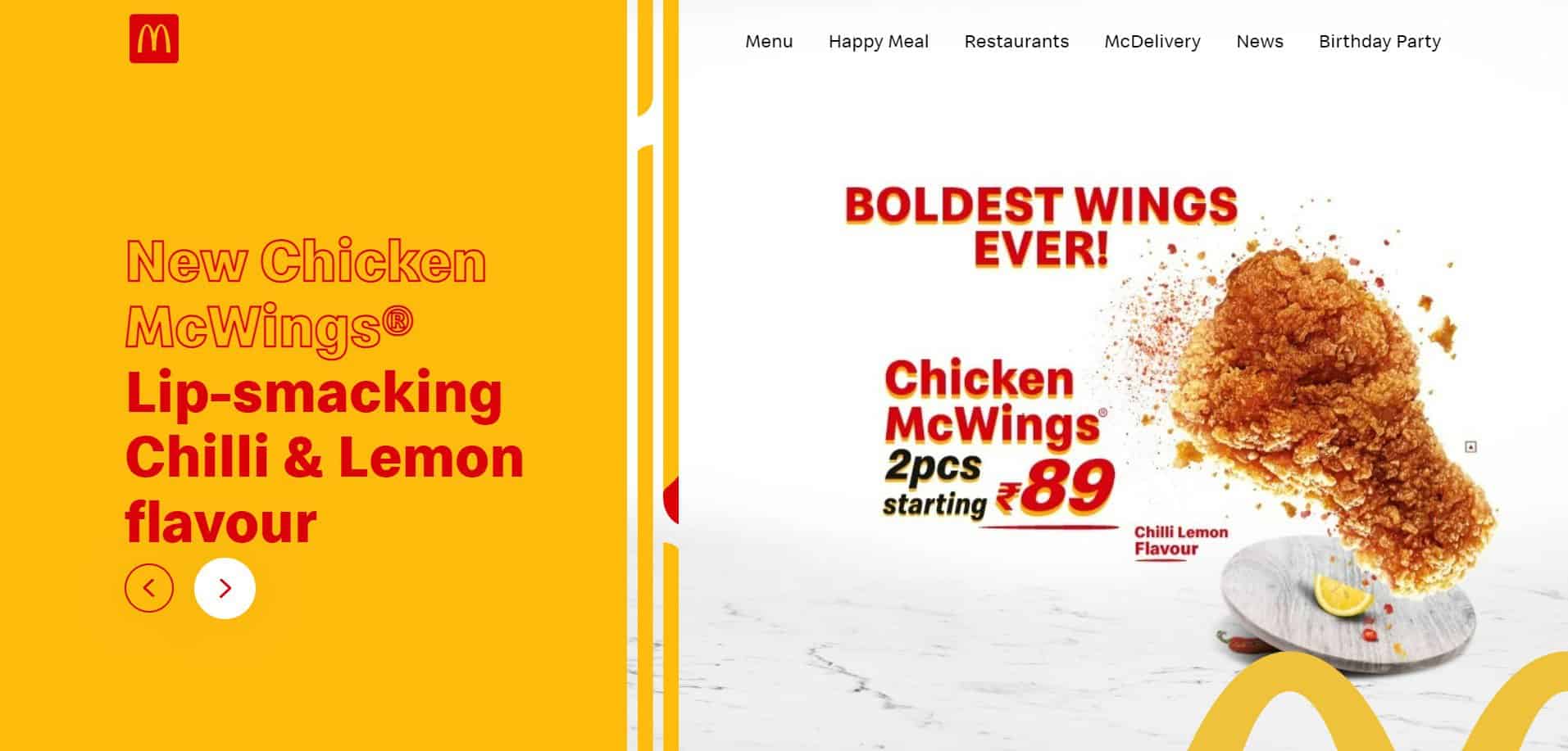
McDonald’s uses red and yellow because they combine harmoniously to create a fun look. There are many food types in the colour yellow, so it is easy to associate the brand logo with food (think fries!).
4. Brown to Communicate Seriousness
Brown is often considered to communicate seriousness. It can also be used to reflect earthiness and confidence. However, when looking into the colour brown, I found that the colour can be quite versatile.
Coffee and chocolate brands use Brown extensively for their websites. It is extremely easy to relate the colour to their products and instantly creates a sense of comfort in the users.
The inherent authoritativeness of the colour brown makes it easy to gain the trust of the users.
5. Orange for Fun, Energy
Like yellow, orange too is a fun and energetic color. However, the meanings associated with orange can differ according to one’s culture and upbringing.
The color is used in advertising because it catches the eye instantly. It is bright and vibrant making the customers feel full of energy. Since the color is associated with citrus fruits, it can easily bring the joyful summer mood to mind. However, it can also be linked to autumn depending on the region you live in.
Orange being a generally energetic color can be used by brands that are involved in such activities. Gyms and sports drink companies can use orange to brand their products. Toys and food industries also use orange to attract their customers.
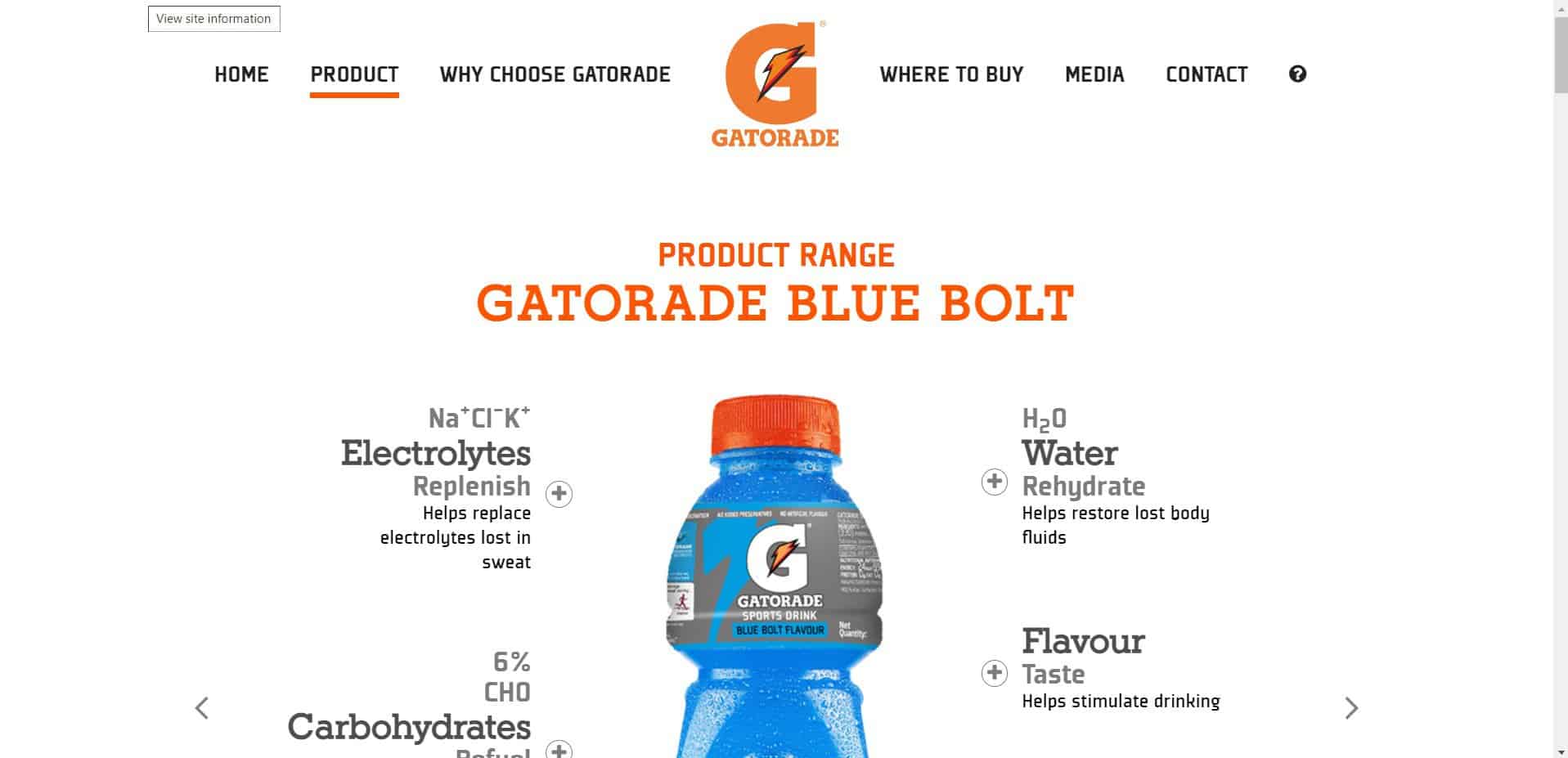
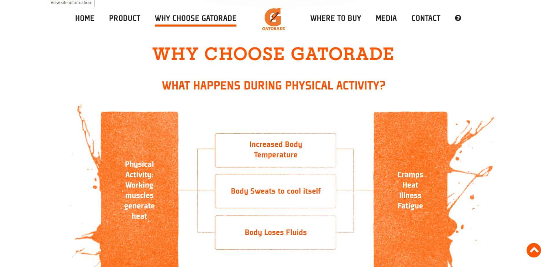
Gatorade, one of the most popular sports drinks uses orange in its logo and for its font as well. The color communicates the energy and refreshment of the product.
So How Can You Use Colors to Influence Users?
With an understanding of the basic color meanings, you can now proceed to apply colors to influence your website users.
If you have an upcoming sale and want to alert your customers, your go to option is the color red. Use red color in the background of your banners to immediately catch the attention of your customers.
Say that your company wants to come across as trustworthy, intelligent and reliable. Use the color blue. It will instantly make the customer like you a little more because blue is the most popular color. Using different shades of blue can imply different meanings. For example, if you want to seem elite then use a darker shade of blue as it is the color of royalty in some countries.
Most companies that want to make their connection with nature known use green. The color is universally related to nature and growth. If your company uses natural products, then use green in your website to establish that connection. Visual cues are easy to register in the minds of the customer.
Express joy and happiness with yellow. A splash of yellow adds excitement to the website. If you are a company that engages in outdoor activities, then it is a great idea to use yellow here and there to express joy and fun. Use the color cautiously.
Brown is used to express authority, seriousness and even represent foods like chocolate. Use brown in your brand website if the elements in your product or service are in brown.
Orange is fun and energetic. If you own a juice brand that is meant to refresh customers, then use orange for the site.
Final Words
Understanding color psychology is crucial for branding and marketing. Using colors strategically can influence your customers. Brand colors are also important to reinforce your brand among customers. Think of your favorite brands and the colors associated with it. Do you not often think of the brand when those colors come together randomly?
You can use similar strategies to design your website with color psychology. So go ahead and get coloring!
Don’t want to stop reading ? Then read about the new trends and technologies in web hosting.